
Your brand font says a lot about you. Choosing a pair of brand fonts can be overwhelming. Take a deep breath, we’re here to help!
It’s important that your brand font speaks to the characteristics of your brand. If you haven’t thought about your brand personality, visit our blog about choosing your brand colors. In our brand colors blog, you’ll find advice on how to determine your brand personality.
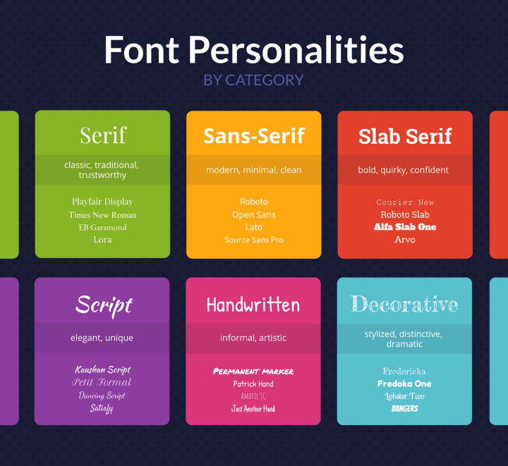
When your customers can relate to your brand, the stronger their connection to your brand will be. When you have cohesive branding across your colors, fonts, and imaging, it will drastically increase your brand awareness. Your goal with your company branding should be cohesiveness. With unique colors, unique fonts, and unique imaging, your audience should be able to recognize your brand the second they see your marketing or branded products. Once you know your brand characteristics, you can refer to this chart to find which type of font you want to use:
The serif font type is the original font style. It is the first font type ever used and therefore is used to convey a traditional, trustworthy and classic feeling. Serif fonts have “feet” at the top and bottom of each letter. Some popular serif fonts are Times New Roman, Playfair Display, and Lora.
Sans-serif is a font type that is much more minimal, clean and modern. Sans-serif fonts do not have feet at the top and bottom of each letter. Sans-serif fonts are popular with modern companies such as Netflix, Facebook and Spotify. Some popular sans-serif fonts are Helvetica, Arial, and Open Sans.
Slab-serif fonts are serif fonts that are larger, thicker and blockier. This provides a mix of traditional and modern feelings. It is typically used in companies that are trying to modernize themselves but still want to convey that they’re reliable and reputable.
To start brainstorming the look you want for your fonts, start pulling inspiration from your favorite brands. Try to pin down which elements of their fonts you like the best. Once you’ve gathered some inspiration, browse fonts and pick a few that you like. A great place to browse fonts is on Google Fonts. You can access that here: https://fonts.google.com/. Once you’ve selected some font options that you like, it’s time to narrow it down.
We recommend having 2–3 brand fonts as you may need different font types for different purposes. There are a few things to consider when narrowing down your font choices. As this will be used for branding, you need your fonts to be legible and easy to read. You also want to ensure that the fonts that you select go together well. If you choose a cursive font for your logo, it’s important that your secondary font is a serif or sans-serif font that’s clear and easy to read for other marketing assets. If you choose to have a third brand font, try to choose something that has what your other two fonts are missing. For example, if your primary brand font is a cursive font and your secondary font is a thin sans serif font, your third brand font could be a bold thick font.
Overall, when you’ve selected all of your brand fonts, it’s important to ensure that you have fonts that complement each other, are legible and versatile. Let’s look at an example:
If your primary font is: Dancing Script
Your secondary font should be similar to: Montserrat
Your third font should be similar to: Anton
To see these fonts, simply look up their name on Google Fonts: https://fonts.google.com/. As you can see in the example above, the primary script can be used for your brand name as it is a handwritten font and can be conveyed as more personal. Your primary font does not have to be a handwritten font. It is easy to read, would be easy to embroider or print onto any team wear, and isn’t too thin. These are things to look for when choosing your primary font as you will use this font the most.
The secondary font shown is a sans serif font that is very legible, moderately thin, and would be easy to embroider or print onto marketing materials, team wear and more. It also goes well visually with the primary font. These fonts could be placed together and be pleasing to the eye. It is important that all of your brand fonts look good together as you may need to place them all together in some instances.
The third font is also a sans serif font that is big and bold. As you can see, it’s very different from the primary and secondary fonts and can be used in instances where something super bold and legible is needed. This can be used for signs and other marketing materials where the audience’s attention needs to be grabbed quickly. It is also beneficial to have a third font in case there are any issues with the weight (thickness) of your other two fonts.
Once you’ve decided on your two or three brand fonts, test them out! Create some mockups of marketing materials and see how your audience responds to them. If you get a good response, you’re good to go! If not, you can always play around with similar fonts until you find the perfect fit for your brand. Once you’ve found your final brand fonts, stick to them and use them as much as possible! The more your audience sees your branding, the easier it will be for them to recognize you. If you have any questions, please feel free to reach out to info@limelightteamwear.com